Property Ducks
— Brand Identity
— Website
— EDM
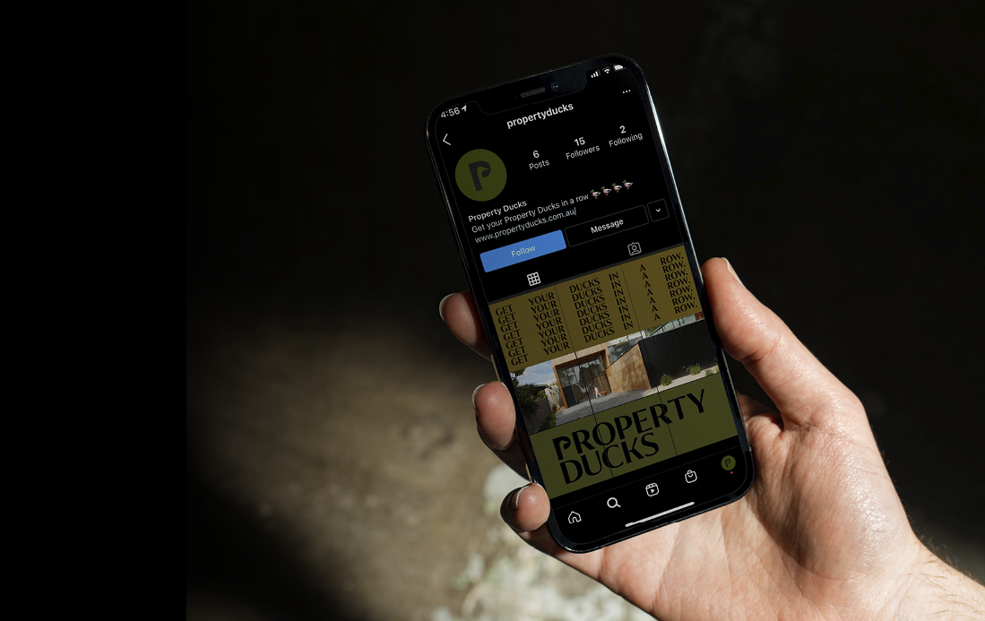
— Social Media Assets
— Proposal Document
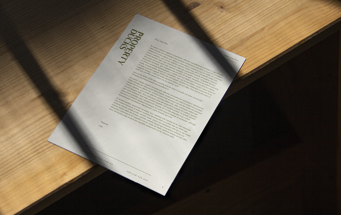
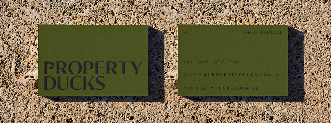
— Stationery
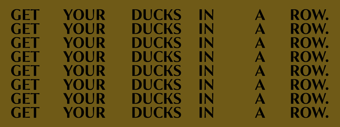
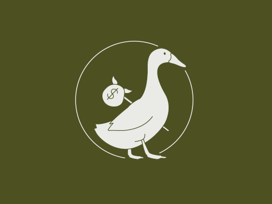
Property investment can be overwhelming, but it doesn’t have to be if you have your ‘ducks in a row’. Property Ducks – a long-term client’s new venture – is a boutique property advisory that aims to take the stress out of buying an investment property.
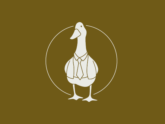
To help our client stand out in a crowded industry, we needed to create a brand that was trustworthy and reliable, while infused with personality.
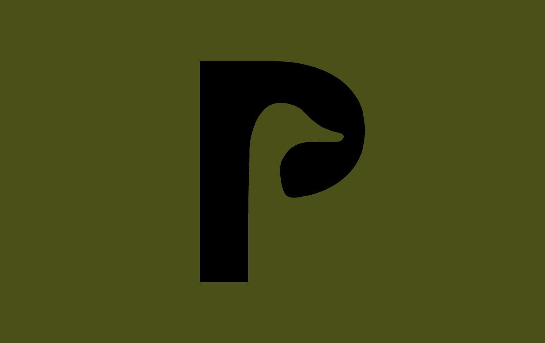
The result is a unique, bold icon and logotype crafted from Begum Sans – its horizontal strokes flaring out and creating wedges, much like a duck’s foot. The D playfully reveals a duck in the negative space. We teamed this with a warm earthy palette inspired by the environment, natural materials and the feathers of a duck.